Makro
Makro
Giving one of Uzbekistan's largest retail chains the identity of a neighbor you can always trust
Giving one of Uzbekistan's largest retail chains the identity of a neighbor you can always trust
Industry
Industry
Food Retail
Food Retail
Role
Role
Brand Designer
Brand Designer
Made
Made
with LINII Agency
with LINII Agency
Year
Year
2024
2024
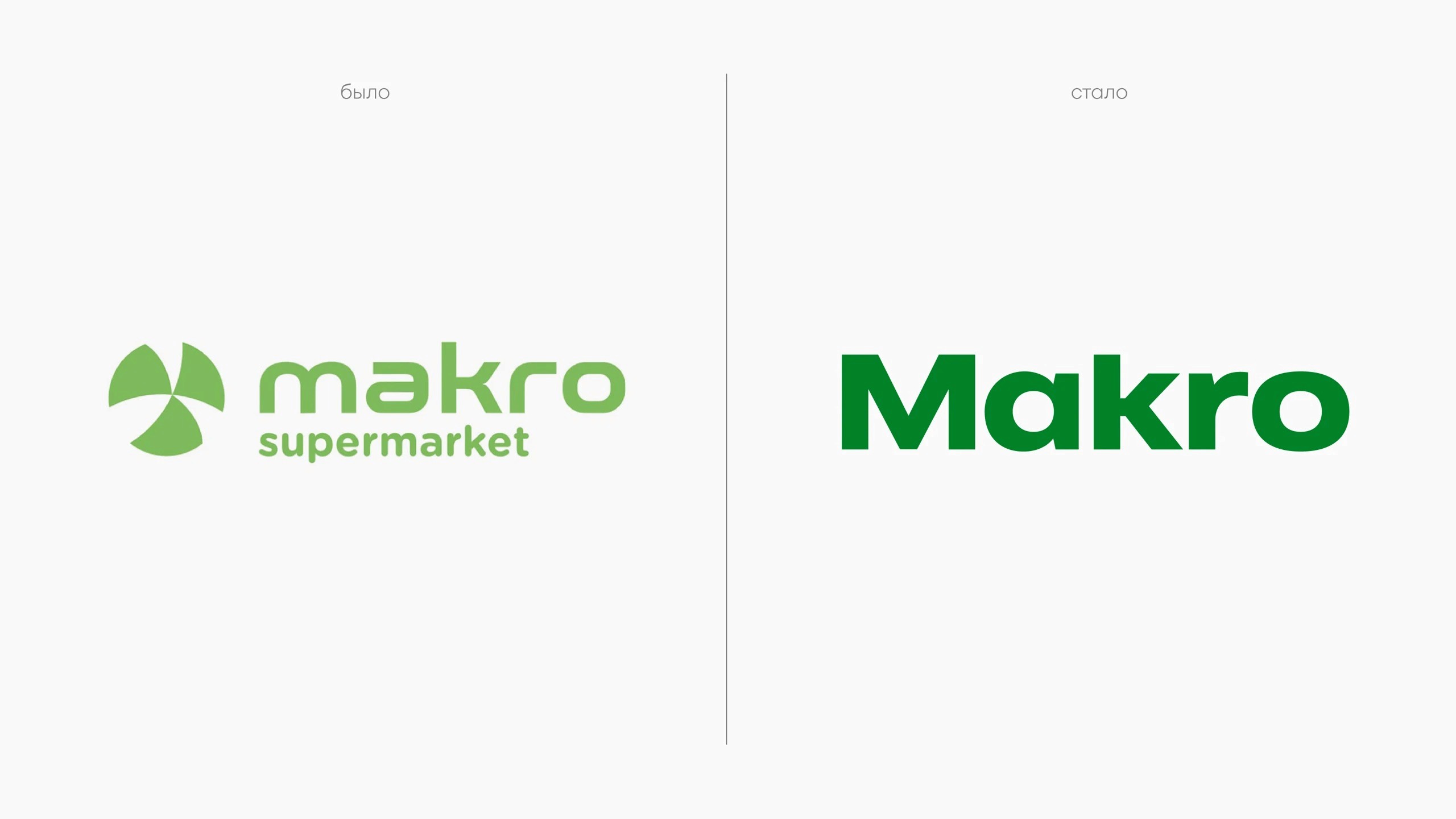
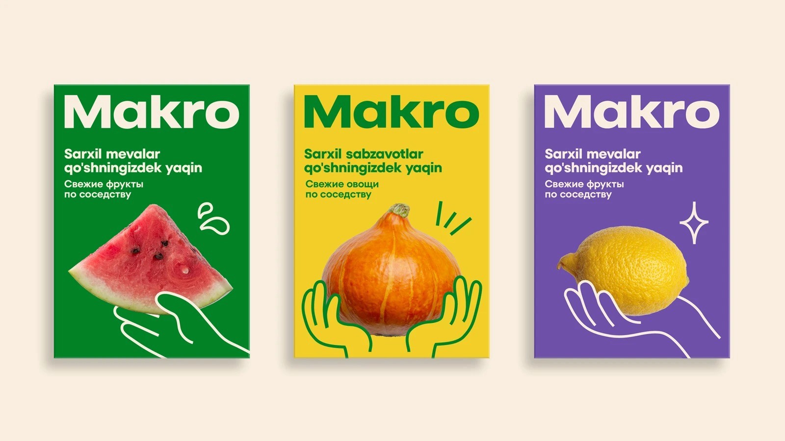
MAKRO is one of Uzbekistan's largest retail chains, with over 10 years on the market. Despite its scale, the brand had always carried a warmth that set it apart, something closer to a neighborhood market than a big-box store. To sharpen that difference and make it work harder, MAKRO brought in LINII for a full rebrand: positioning, visual identity, and retail concept. The strategic team found the right metaphor in the mahalla, a traditional Uzbek neighborhood where community life spills into the streets and everyone knows everyone. That idea became the foundation: MAKRO as "a neighbor who turned into a true friend" — honest, warm, and always there when you need something.
MAKRO is one of Uzbekistan's largest retail chains, with over 10 years on the market. Despite its scale, the brand had always carried a warmth that set it apart, something closer to a neighborhood market than a big-box store. To sharpen that difference and make it work harder, MAKRO brought in LINII for a full rebrand: positioning, visual identity, and retail concept. The strategic team found the right metaphor in the mahalla, a traditional Uzbek neighborhood where community life spills into the streets and everyone knows everyone. That idea became the foundation: MAKRO as "a neighbor who turned into a true friend" — honest, warm, and always there when you need something.

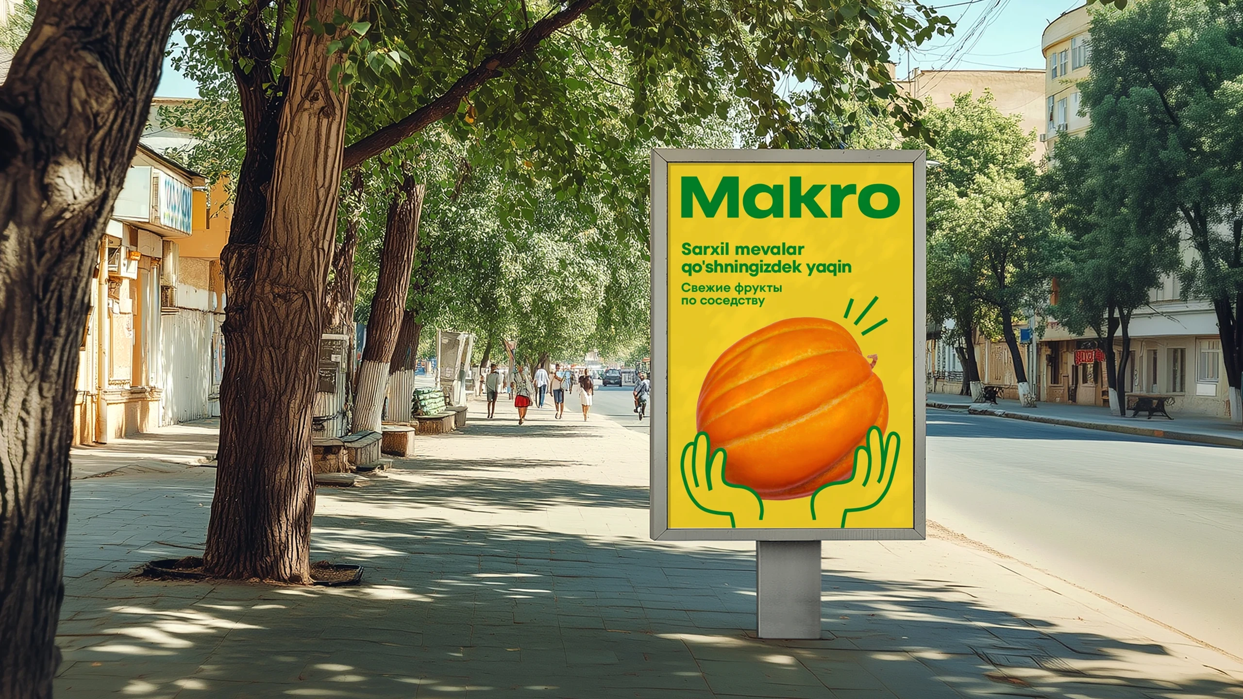
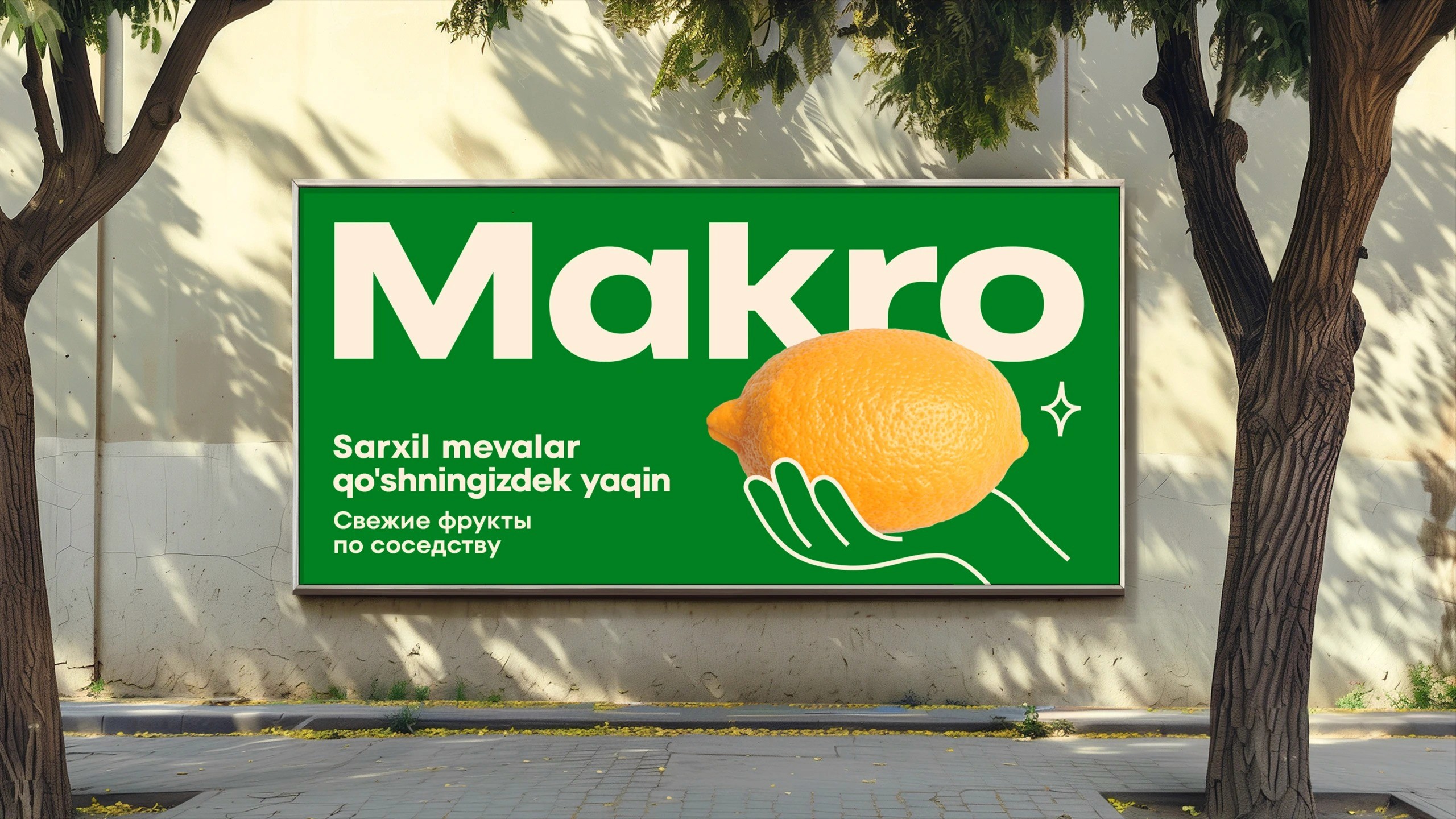
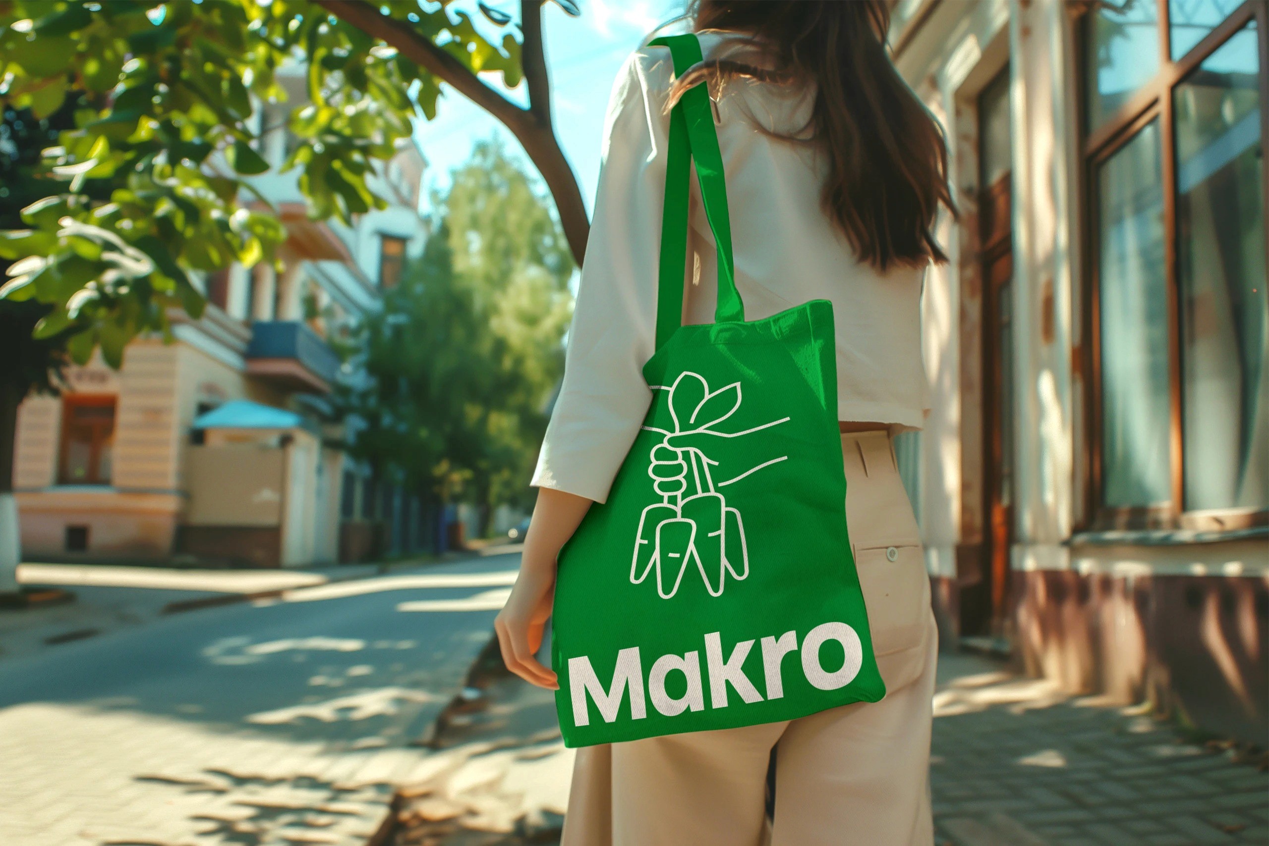
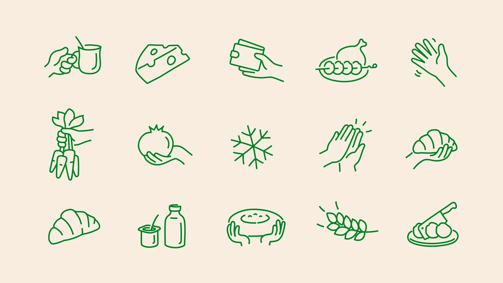
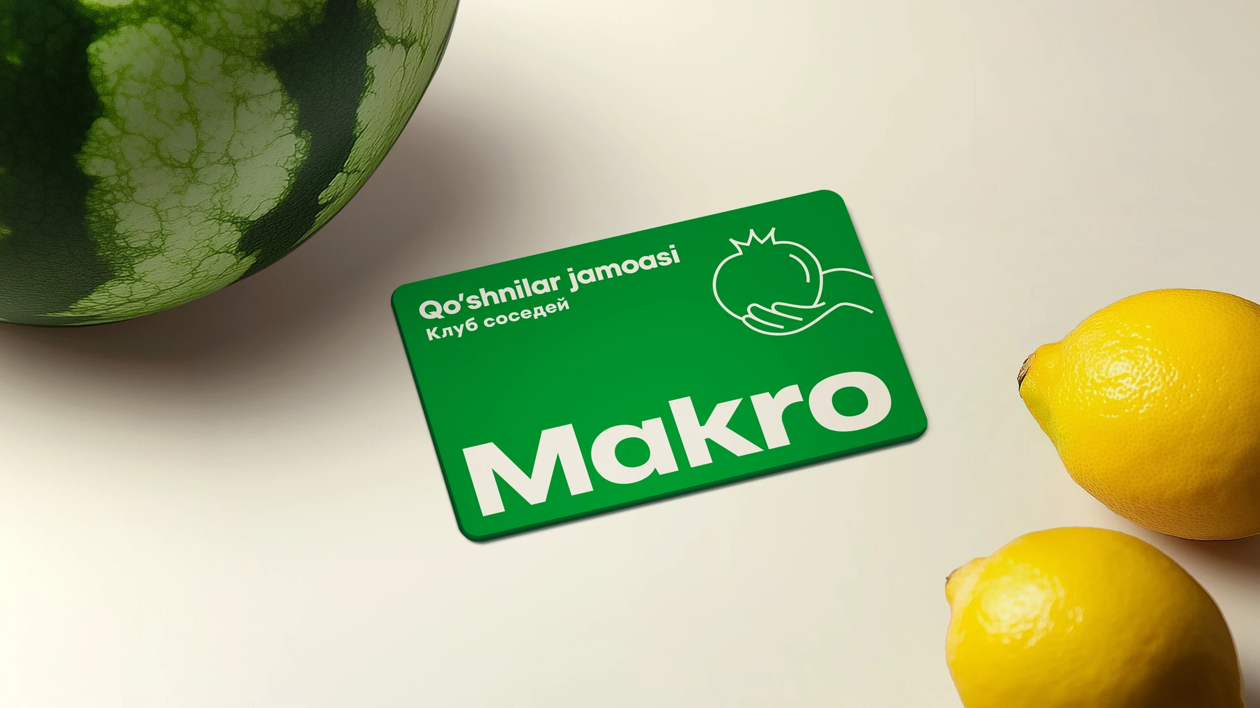
As brand designer, I developed the visual identity that brought this character to life. The central element — illustrative hands — carries real cultural weight in Uzbekistan, evoking greeting, gratitude, generosity, and the sharing of food. A fresh green and sandy palette, bold friendly typography, and a mix of product photography with hand-drawn illustration give the brand energy and humanity. The retail concept made by LINII retail team extended the mahalla idea into the store itself: natural materials, warm lighting, market-style counters for meat, cheese, and freshly baked tandyr bread — a space that feels less like a supermarket and more like a place you actually want to be.
As brand designer, I developed the visual identity that brought this character to life. The central element — illustrative hands — carries real cultural weight in Uzbekistan, evoking greeting, gratitude, generosity, and the sharing of food. A fresh green and sandy palette, bold friendly typography, and a mix of product photography with hand-drawn illustration give the brand energy and humanity. The retail concept made by LINII retail team extended the mahalla idea into the store itself: natural materials, warm lighting, market-style counters for meat, cheese, and freshly baked tandyr bread — a space that feels less like a supermarket and more like a place you actually want to be.

Agency: LINII Art Director: Nikolay Demin Designer: Kirill Zharkoy