Eskhata
Eskhata
Rebranding one of Tajikistan's top-3 banks from a financial institution into a bank for the people
Rebranding one of Tajikistan's top-3 banks from a financial institution into a bank for the people
Industry
Industry
Finance
Finance
Role
Role
Brand Designer
Brand Designer
Made
Made
with LINII Agency
with LINII Agency
Year
Year
2024
2024
Eskhata has been part of Tajikistan's financial landscape for 30 years. As one of the country's three largest private banks, it serves millions of individuals and businesses — and its name, meaning "to remember," speaks to everything the brand stands for: closeness, trust, and lasting commitment. Entering a new stage of growth, the bank needed to evolve: sharpen its positioning, build a design system with clear rules, and shift its identity toward something more human and emotionally resonant. The brand's mission — to become an indispensable part of every family and every business in Tajikistan — had to be felt in every visual touchpoint.
Eskhata has been part of Tajikistan's financial landscape for 30 years. As one of the country's three largest private banks, it serves millions of individuals and businesses — and its name, meaning "to remember," speaks to everything the brand stands for: closeness, trust, and lasting commitment. Entering a new stage of growth, the bank needed to evolve: sharpen its positioning, build a design system with clear rules, and shift its identity toward something more human and emotionally resonant. The brand's mission — to become an indispensable part of every family and every business in Tajikistan — had to be felt in every visual touchpoint.


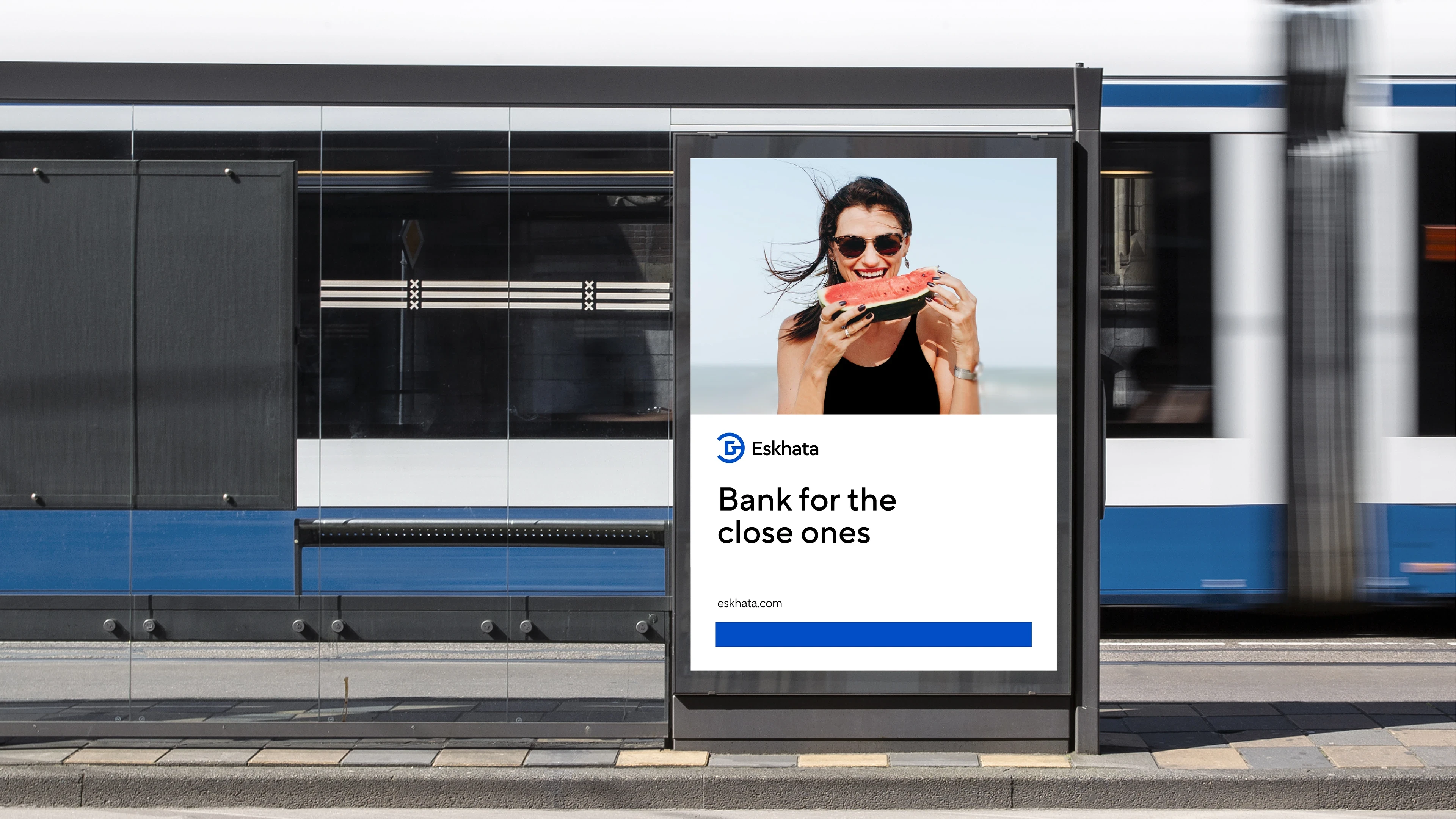
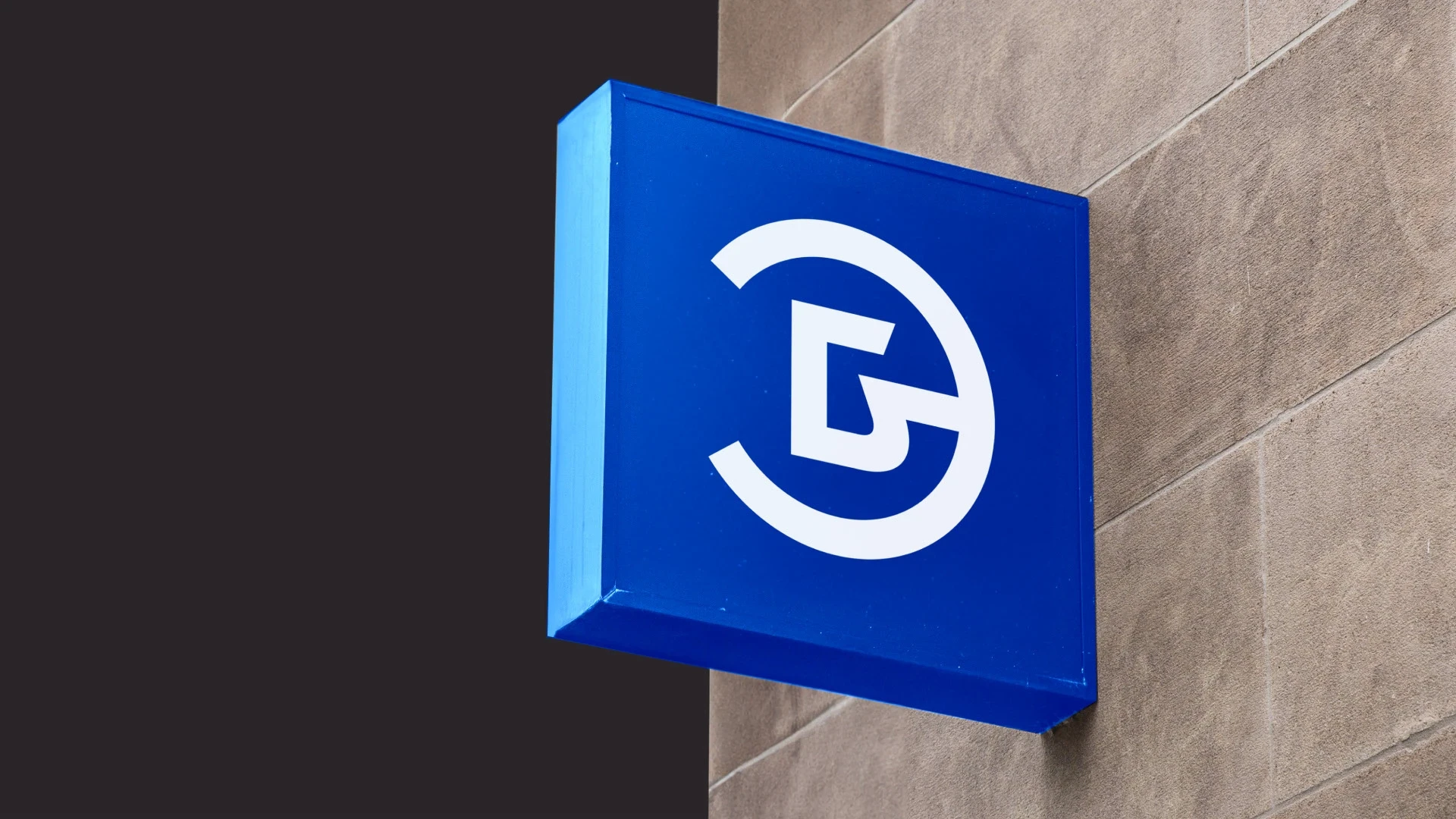
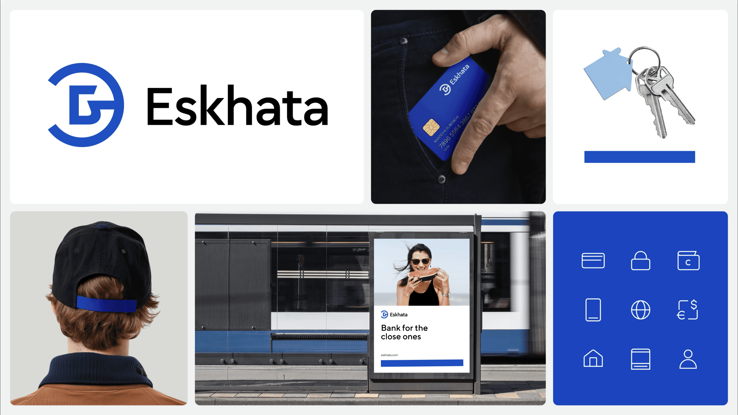
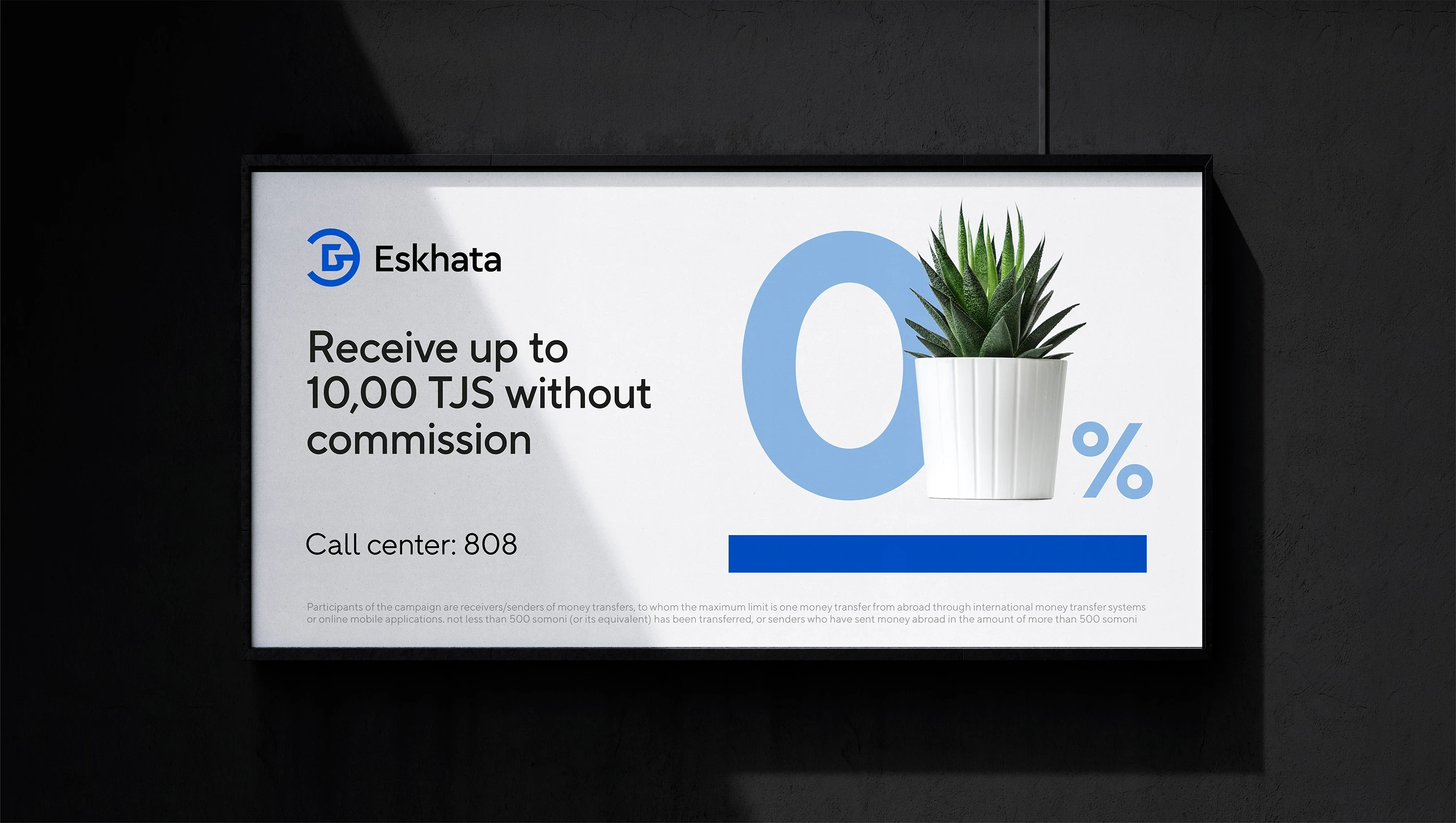
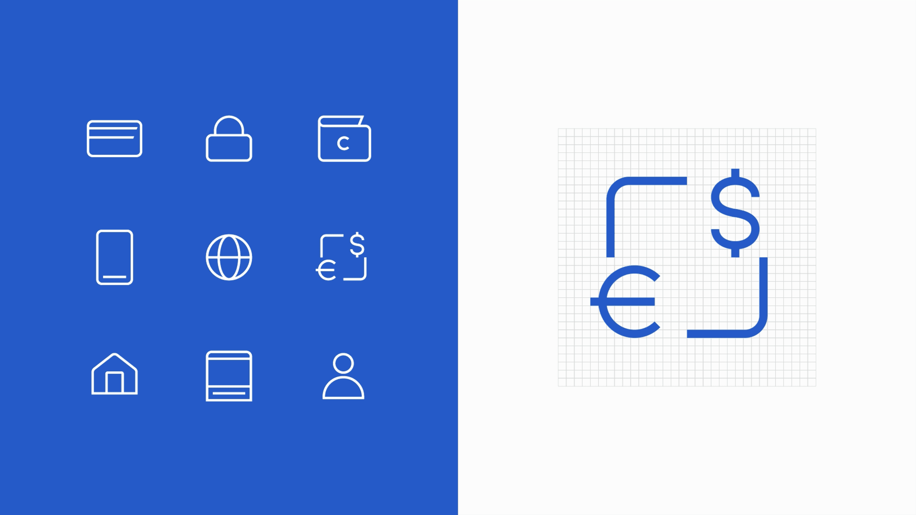
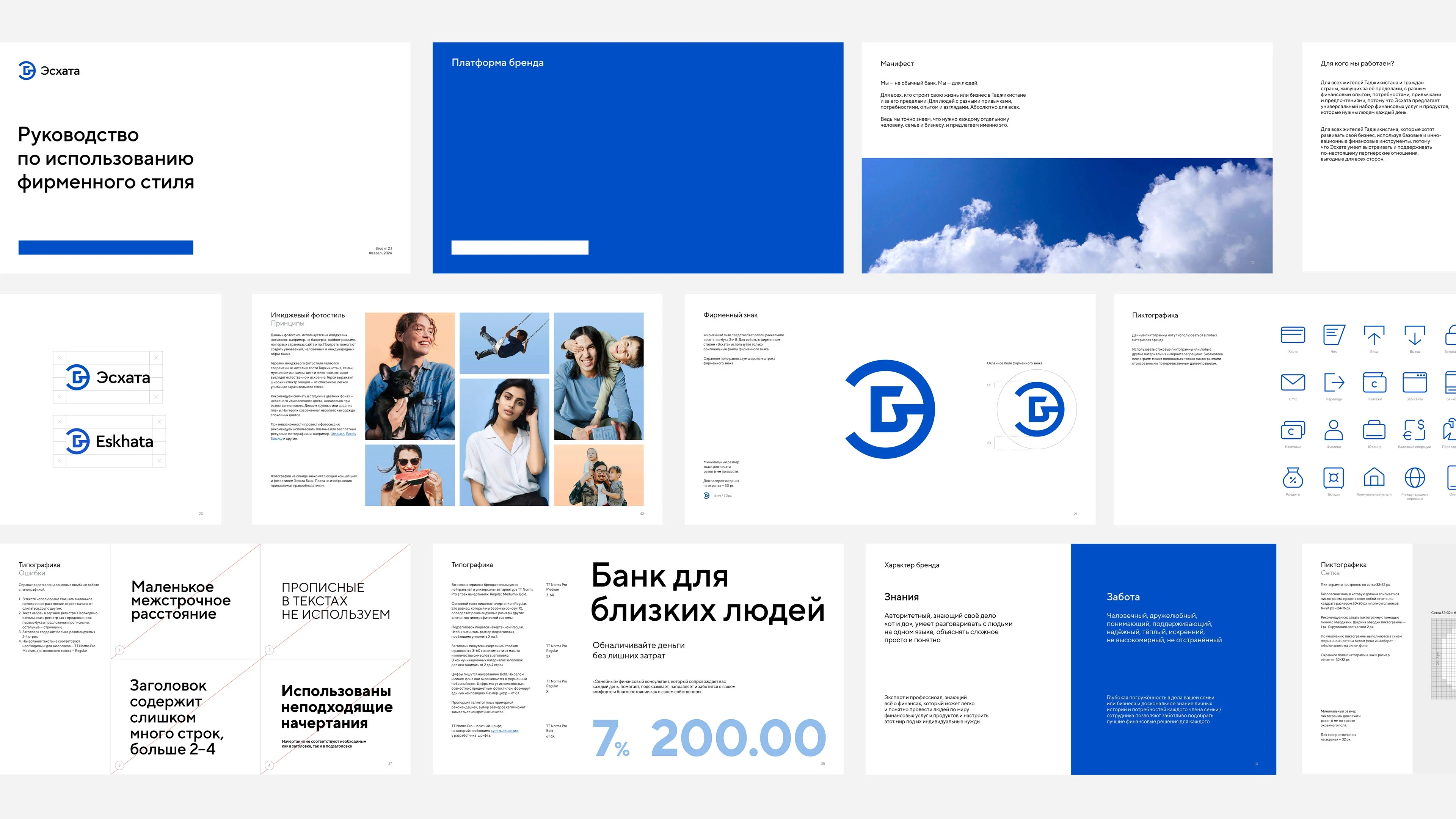
As brand designer at LINII, I developed the full identity concept (excluding the logo), produced all visual assets, and created a comprehensive brandbook built for practical, day-to-day use by a team with limited branding experience. The renewed identity is anchored by a continuous blue line — a symbol of the bank's constant presence and support in people's lives. Natural portraits of Tajik people, 3D illustrations, and simple pictograms make the brand feel approachable and real. The signature blue was refined in tone and expanded with sky blue and warm sandy accents, creating a palette that feels both trustworthy and human.
As brand designer at LINII, I developed the full identity concept (excluding the logo), produced all visual assets, and created a comprehensive brandbook built for practical, day-to-day use by a team with limited branding experience. The renewed identity is anchored by a continuous blue line — a symbol of the bank's constant presence and support in people's lives. Natural portraits of Tajik people, 3D illustrations, and simple pictograms make the brand feel approachable and real. The signature blue was refined in tone and expanded with sky blue and warm sandy accents, creating a palette that feels both trustworthy and human.
Agency: LINII Art Director: Julia Plotnik Designer: Kirill Zharkoy Logo Design: Ilya Savonkin